Project: Business Redesign
Abstracting
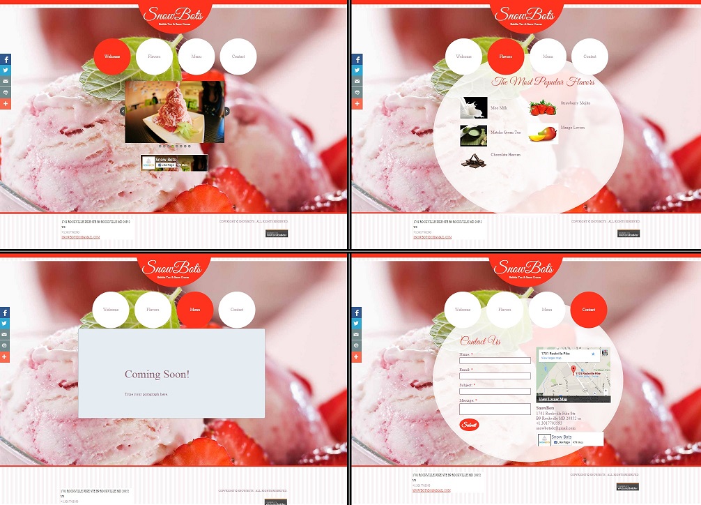
I wanted experience developing for a client and decided to seek out a local business to pitch. I found a business with a website that needed some help, but after a few failed attempts at getting in touch with the owner I started to get discouraged. That's when I realized that I could get the experience of working with a client without actually having one. I decided to reimagine their website on my own. And if I ever did get an opportunity to pitch the business, then I'd have something tangible to present.
Researching
The business I targeted – Snowbots – is in the dessert industry and popular for a speciality product known as snow cream. Snow cream exists somewhere between snow cones, frozen yogurt, and ice cream, so I started researching the online presence of other similar popular dessert shops in the industry. Many of them shared common themes in the user interface, graphics, and color scheme. I also listed important considerations, such as typical clientele, target demographic, and the atmosphere Snowbots hoped to create around their business.
Drafting & Designing
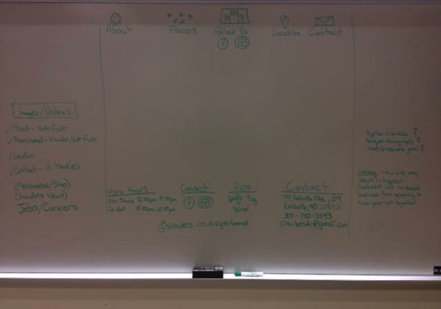
I began with my initial process WOW (Wireframe on Whiteboard™) to get out ideas about the essentials of a personal business website. This included content like an "About" and "Flavors" section, as well as footer details like store hours and contact information.
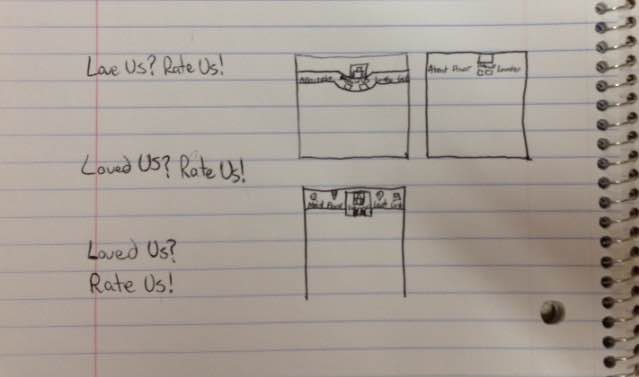
I also created a few different mockups to test out the best positions for elements like navigation features and interactive buttons.
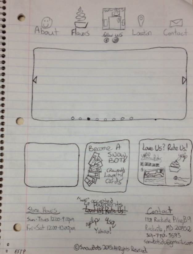
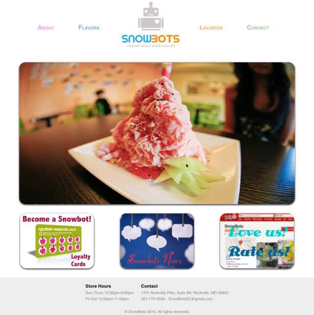
Lastly I designed the complete landing page, and finalized my decisions about graphics, sizing, and positioning. I sought to create a user interface that was colorful, striking, easy to use, and had appeal with a younger audience. I developed the new site based on this design, and I talk about that process in more detail below.
Coding
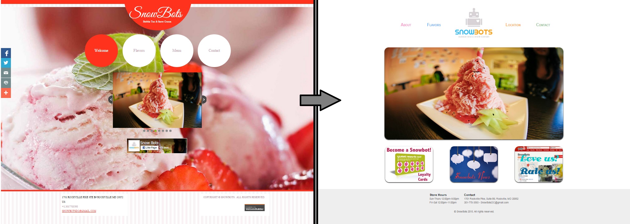
The image above shows the before & after of the project.
Because there was only a modest amount of text in the landing page, the HTML was simple while most of the magic happened in the CSS. The first area I tackled was clearly defining the header, body, and footer sections along with the appropriate containers within them. Soon after, I filled in the details of the footer section.
Next I installed a large central image as a placeholder; in the future this would have been a scrolling photo carousel powered by JavaScript. Underneath the central image I installed buttons that would become future sections of the site. I created the buttons with Photoshop and used open-source images from Google as temporary backgrounds for presentation only. I also added a slight border radius and some box shadow to give them a clean finish.
Lastly, I installed the navigation buttons and logo. Keeping the logo centered in the navigation was very tricky, but with some trial and error I finally found the right combination of height, width, and margin to make it work. Ultimately it took a piece-meal approach and a lot of patience, but I finally had my first landing page.
Click the image below to take a closer look at my redesign.
